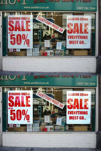
EL and traditional posters compared on attention, durability, reuse and cost per campaign, with the scenarios where print still wins.

Ten EL poster layouts that work, with notes on contrast, stroke weight and zone count so you can adapt the approach to your own artwork.

Design technique for EL posters: stroke weight, negative space, zone timing and the colour shifts that happen once the panel is lit.
Why an EL panel fades, why it can look patchy, and what the datasheet numbers actually measure. Written for buyers comparing supplier claims.
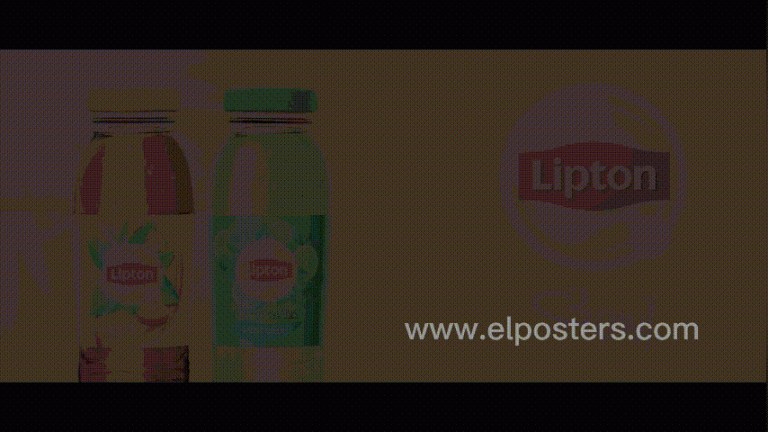
An eye-catching display is a lighting decision before it is a design decision. Here is how contrast, zone timing and mounting shape the result.
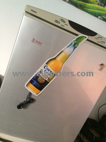
Home décor EL projects work when brightness, colour temperature and size are matched to the room. Here is how to specify them without over-lighting.
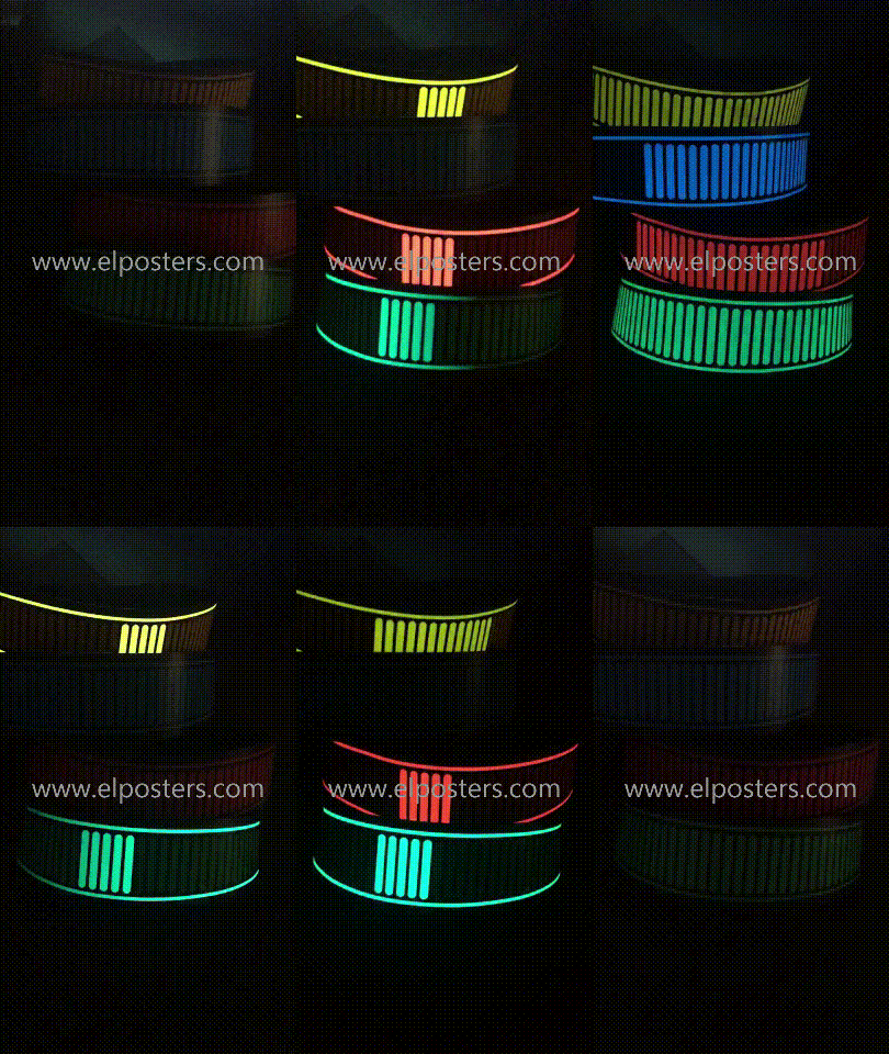
Trends in animated light for retail and events, separated into what is production-ready and what still needs a custom build.
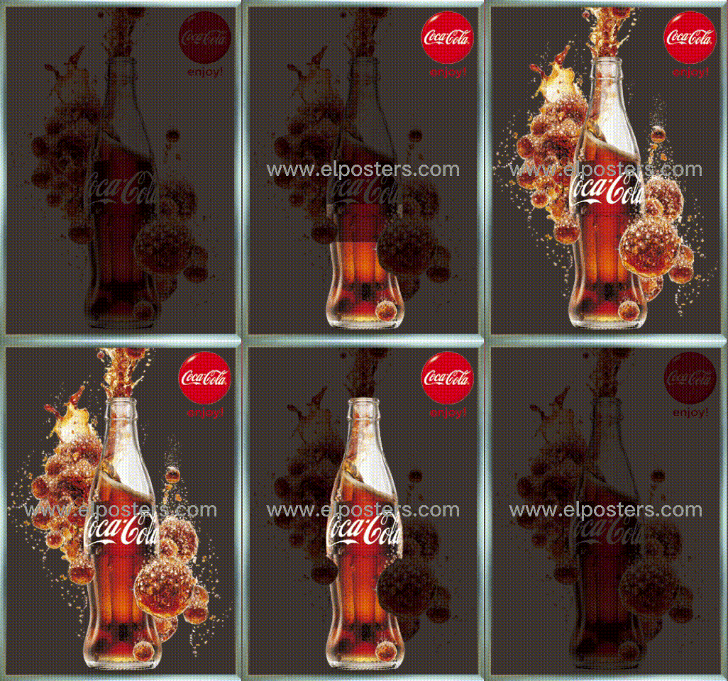
Choosing an EL poster is a sequence: viewing distance, mounting surface, power access, then artwork. Skipping a step is what causes a rebuild.
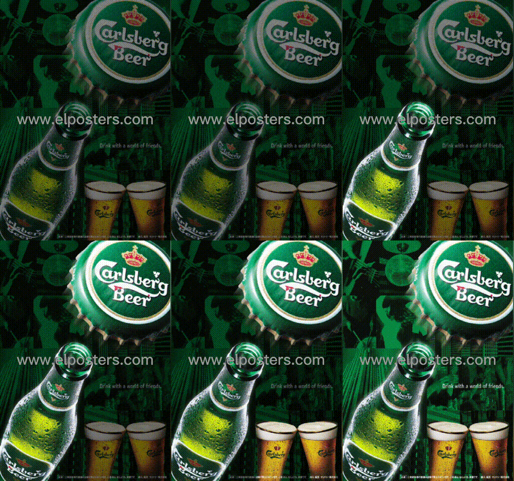
Design inspiration for EL posters, with the production constraint behind each idea so you can tell which ones are buildable at your quantity.
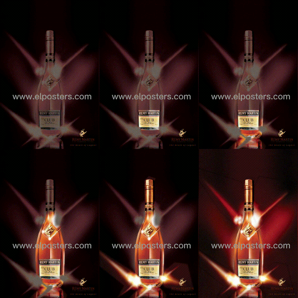
EL and traditional printing differ on brightness, durability, reuse and cost per campaign. Here is the comparison most supplier pages leave out.